UI/UX In-Depth: Lloyd's Bank
What does a bank's website communicate and how?

📩 If you have any questions, comments, or suggestions - please contact Guillermo Pablos Murphy on Tela:
tela.app/id/guillermo_pablos_murphy/621afa
🤝 Add Guillermo Pablos Murphy on LinkedIn:
linkedin.com/in/guillermo-pablos-murphy
🌎 Read the Tela Network log:
tela.network
Question
What does a bank's website communicate and how?
Objectives
- Interpret the UI/UX design of Lloyds Bank's website (https://www.lloydsbank.com/) into 'vibes'.
- Analyse how the UI communicates those 'vibes'.
- Break-down specific elements of UI and justify choices.
- Explain the UX and possible motivation behind it.
Contents
- Context
- Vibes
- How are these vibes achieved?
- User Interface: Detail
- User Experience
Context
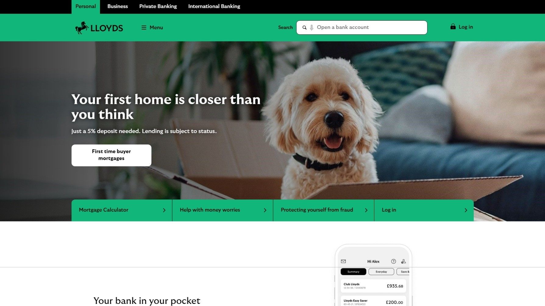
Lloyds Bank is major UK retail and commercial bank with a focus on traditional financial services like mortgages, savings, and business banking.
Screenshot of landing page on the 27th of September 2025.
I suggest you scroll through the screenshot above before reading the analysis.
All the sections and details referred to will be featured in specific screenshots.
Vibes
Homely, familiar, classic, serious, established, approachable, fresh, helpful, quaint.
How are these vibes achieved?
Homely & familiar:
- The first thing a user sees when entering the page is a small dog in a cardboard box with a sofa and a houseplant in the background. It's quite literally a picture of home comforts: a happy pet, a comfortable living room, and the open cardboard box (associated with presents, new things, moving to a new - better - home). An image primes the user to experience the rest of the interface in a certain way. It's important to understand the associated experiences certain images will evoke for users and imply in regards to a product when choosing them for UIs.
- The colour palette used in the website is calm and soft without being diffuse. Medium sea green (#11B67A), black (#000000), white (#FFFFFF) scheme. Touches of gray for specific sections: #F1F1F1, #7F7F7F, #303030, etc. Green is nature, dreamy, growth, understanding, and more. The UI's colour scheme on this page associate finances to tranquility and life.
- Mention of "home" in main call: "Your first home is closer than you think". It anchors the user to think of home - of comfort, calm, and sense of belonging. This has a double purpose: 1) Lloyds is pushing the sale of mortgages, so it wants the user to think of a future home, and 2) it predisposes the user to experience the website with a positive emotional backdrop: home, comfort, belonging.
Classic & serious:
- Lloyds Bank's logo is a side-profile of a horse rearing up. The horse has Ancient Greek-like indents on the back its neck, running down it's back - like a race horse or a mount out of a heroic myth. We associate a horse like this with nobility, with legitimacy. The two-dimensional pose is also right out Ancient Greek vase art, as well as neo-classicist paintings. This helps associate Lloyds Bank with elegance, high-status, and permanence.
It's worth mentioning that this logo clashes with the rest of interface and UX, which prioritises a helpful, familiar, and approachable image. However, the seriousness and classic feel that the logo evokes could work to reassure the user that behind the approachable brand there's a serious, establishes - Font-background colour parings are black on white, black on green, black on grey, and white on black are very readable combinations. Text is readable. Information is clear. Serious, no-nonsense design.

Established:
- The top of the page has four tabs: Personal, Business, Private Banking, & International Banking. A quick scan of this will inform the user of the banks' well-established, broad customer base. Anchored as the user is to think of the bank as a familiar and classic brand, the four areas of the business, laid out as if they hold equal weight communicates that the bank is a well-run enterprise. The user can be confident in trusting them with their savings, mortgage plan, etc.
- "Join our 10 million customers who already use our highly rated app." The app (and the bank's offering) is tried and tested. Popularity is taken as a shorthand for trustworthiness.
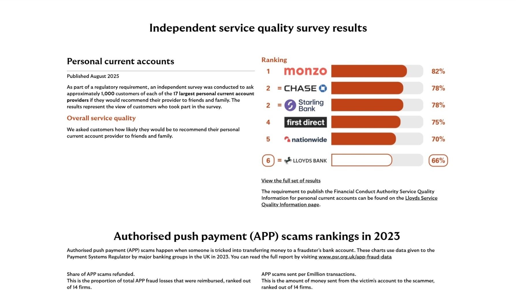
- The page includes a "Independent service quality survey results" section near the bottom of the page. Rankings help users determine whether to use a business, just like ratings. And although Lloyds Bank is not in the top five of the ranking, just their presence on what reads as an independent survey of customer satisfaction adds to their perceived legitimacy. It feels like the sort of ranking an established bank would be on, regardless of their actual rank. Of course, it does help that they are number 6 on the ranking, and not at a lower rank.
Approachable & fresh:
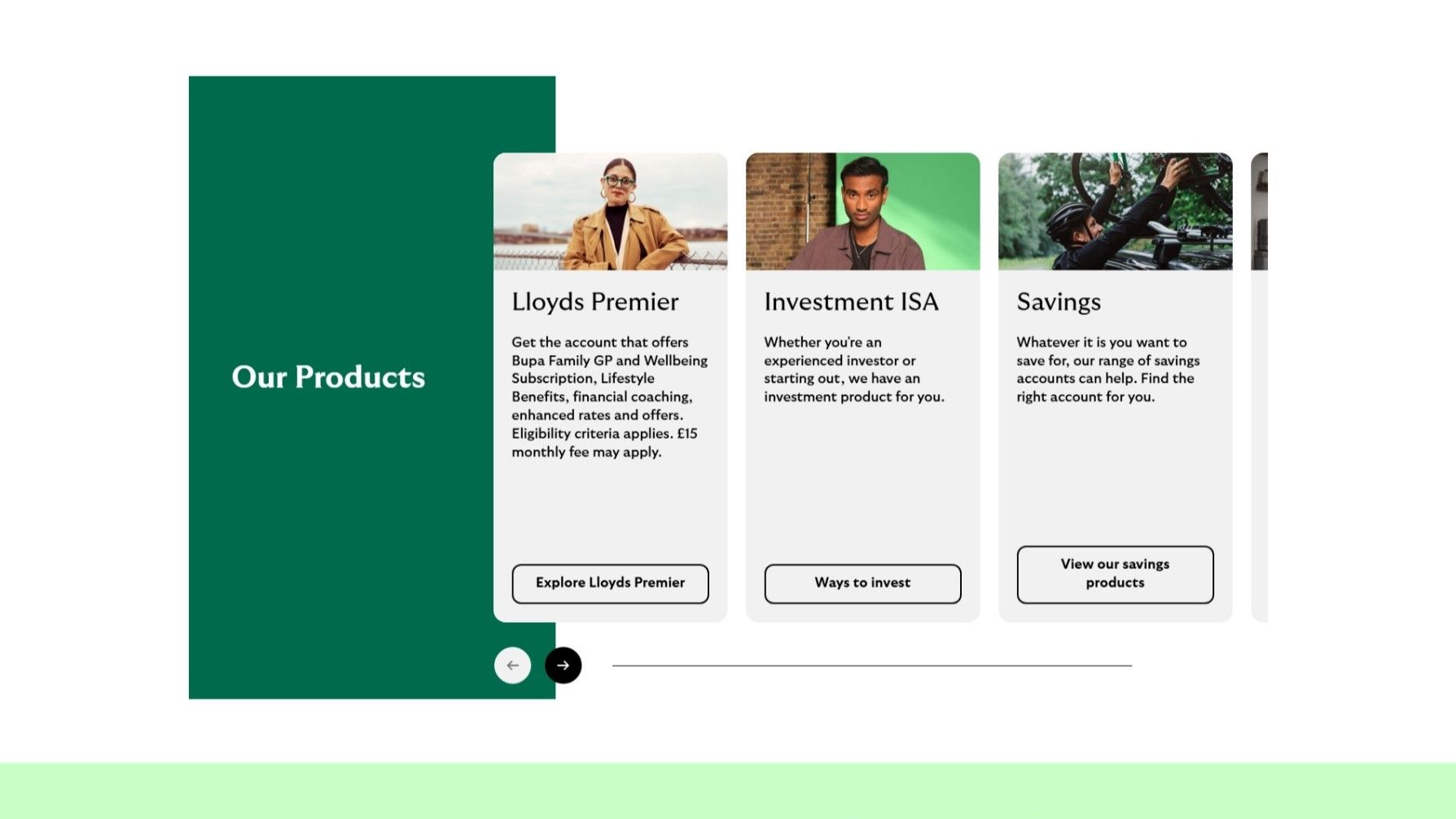
- The other photos included in the page are of young, good-looking people, fashionably dressed and/or with a nice car or bike accompany each of the Products. The website is targeting first-time home buyers, which will likely be young people. Having earlier associated that brand with popularity (by pointing out ratings and the amount of users), it's good to put a face to these users that you would be customers can associate themselves to, even if aspirationally. By including handsome, well-dressed, attractive photos of young people, the UI is appealing to a certain kind of customer.
- The green colour palette creates an inviting atmosphere, especially when tied to the youthful people featured in the photos. There's a fresh, spry feel to the product being offered because of the image and colour associations.
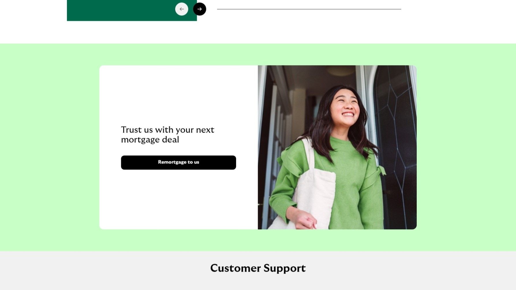
- There's a large photo of beaming young woman leaving a house through the front door, looking ahead and slightly upwards with warm-toned jumper, next to "Trust us with your next mortgage deal". The low angle the photograph is taken from and the upward gaze of the subject lead the viewers' eyes high and to the right. Like a right-facing arrow, this is associated with something new. And something higher is something better. The subject of the photograph is looking out at something better. The natural sunlight and the fact that the subject of the photo is standing at an open doorway also invite associations of a new venture. The bright colours, large jumper, and hip tote bag evoke feelings of comfort, youth, vigour, and optimism.
Associating these colours in this image with the call to action "Trust us with your next mortgage deal" directs the user to associate the emotions evoked by the image to the product they are being sold. In this case, mortgages.
Helpful:
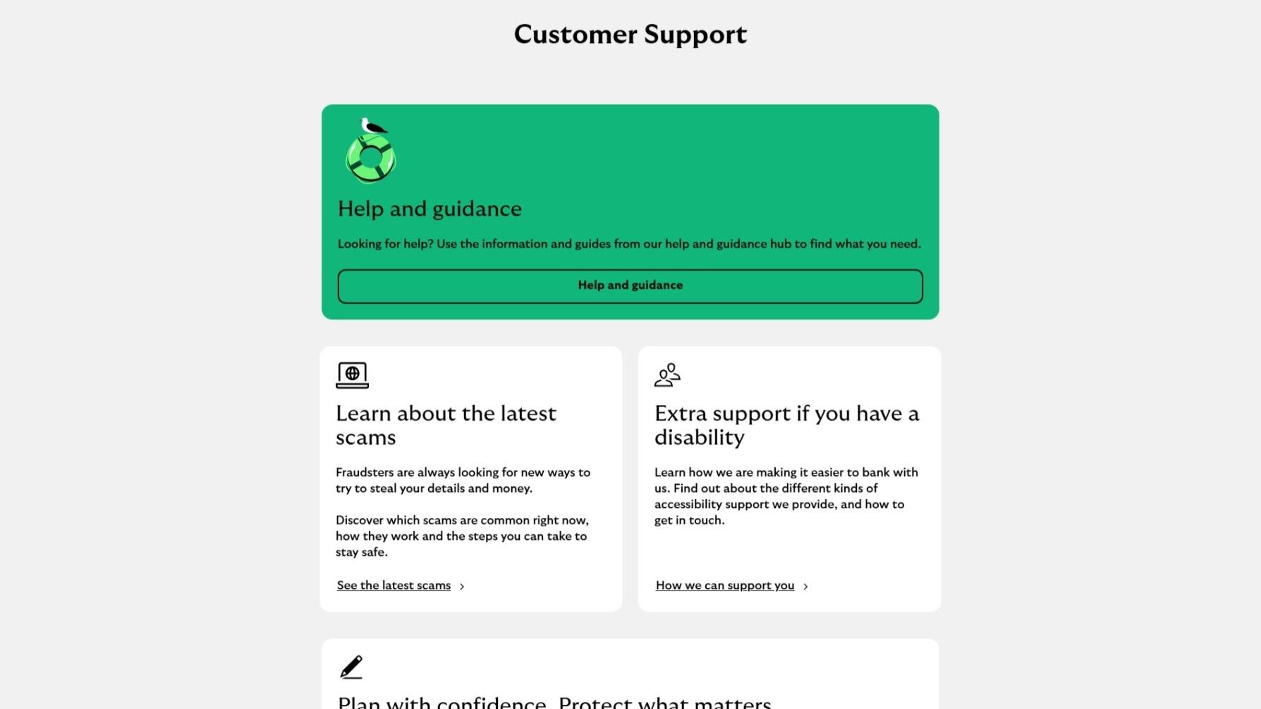
- There's a large section of the website dedicated to "Customer Support". The largest subsections is highlighted in green - an inviting colour, and features an icon of a seagull on a life ring. The image brings some levity to the consumer decisions a user is being asked to consider. It's followed up with the question: "Looking for help?", phrases earnestly and conversationally.
- The other subsections offer advice, disability support, and materials to assist with the consumer decisions. The well-populated support section communicates that there is help available, even eagerly at the disposable of the user. It also asks the consumer to place themselves in the position of someone thinking of buying a mortgage, which helps sell the banks primary offering.
Quaint:
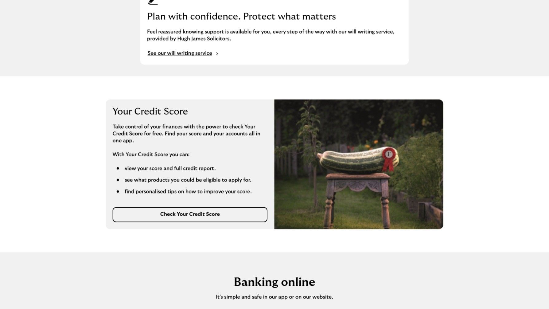
- The photo of an over-sized zucchini on a stool in a vegetable patch garden with a red "1st Prize" ribbon next to "Your Credit Score" is a great follow-up to the support section. It carries on the levity of the seagull image with a picture that, while comedic, also evokes the nostalgia of old, green England with its grannys and country-farms. It's wraps all the way back round to the homely, familiarity of the dog at the start.
User Interface: Detail
The way the UI is designed, the first thing a customer will see will be the dog in the photo, then the hero text "Your first home is closer than you think" and the white button below it, and thirdly, the company logo and name, then working down the page in a left-to-right sequence.
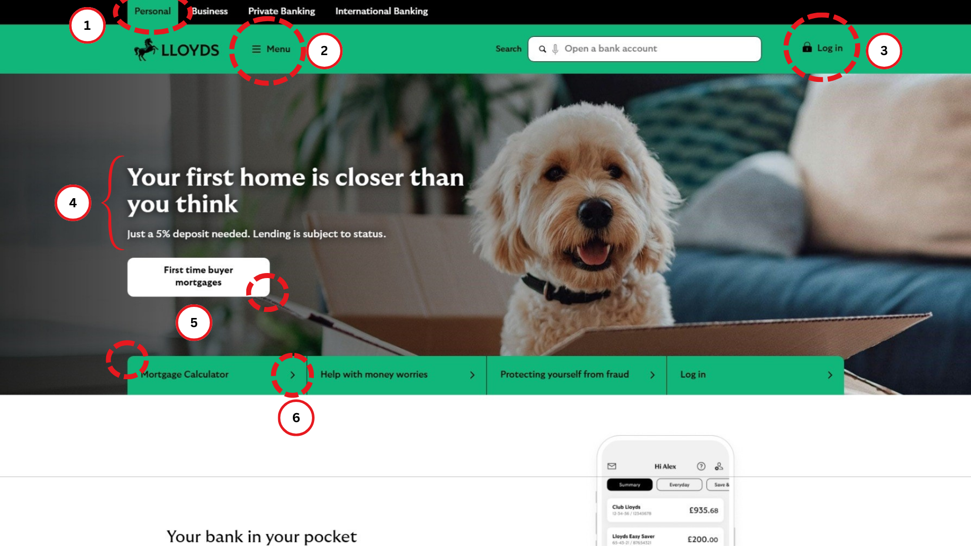
- Tabs are easy way to visually show that your website (and your business) have different customers they can cater to. It makes it easy to track what area you're looking at and to move to and from another area in a single action. Putting it at the top of the page makes navigating the page quick and easy. Tabs imply that everything below is related to the area they represent.
- Horizontal lines by a menu are a shorthand for the button to click when you can't see what you're looking for. Being immediately below the tabs and beside the company logo, both aligned to the left of the screen, means that what the customer will see if they scroll to the top is the name of the company, the areas it covers, and the button to click when they need extra options.
- A lock symbolises security, and very common for bank interfaces to use them as icons next to their access button. People are also quick to associate locks with entry points and it effectively communicates the privacy of access as well - one key, one lock.
- The primary call-to-action, slogan, and/or value proposition an enterprise wants to communicate that is visually elevated in the UI is called the 'hero text' - here, "Your first home is closer than you think". It's worth analysing how the choice of words frame the UX. And it's a quick way to know what the business wants you to think it's selling.
There are two direct calls to the customer, "your" and "you", immediately making the sales pitch and their product about the could-be customer. It also makes the pitch more human, less corporate. "Home", not a mortgage, is the product, and "closer" communicates that the product is achievable - it's the "and, you can have it" part of the pitch. It's optimistic to wary customers. "First" reveals who the desired customer is: first-time house buyers. Finally, "think" is a subtle way to prime the customer, you're now thinking about a first home, whether or not you were before you read this sentence.
The words don't do this by themselves of course. As a sentence, "Your first home is closer than you think" is very powerful. It's conversational, not corporate. It's direct and appeals to the attractive fantasy that a first home is more achievable than you expected. The phrasing even emulates a playful jest, as if what they're offering is a gift they know you'd like - it's something that you think about.
The support text beneath it is "Just a 5% deposit needed. Lending is subject to status.". Consider the effect of "just". It primes the customer to intepret the "5% deposit" as simply achievable, but remarkably so. I assume that regulations force the bank to include the second sentence, as it breaks from the conversational tone that the two preceding sentences use and doesn't do anything to elevate the sales pitch. - The primary interactive element tin UI/UX design is called the CTA (call-to-action) button. In this page, it says "First time buyer mortgages". As a general rule, you want to have one button per page that you, as the designer, want the user to press. Often that's "Sign up".
Lloyds Bank's CTA button stands out by using black text over a white button over a section of the background image with darker shadows. Contrast is visually satisfying and draws the gaze. The CTA button is a rectangle with rounded edges, a shape that other buttons on the page copy. It's become part of the shorthand in visual design to make rectangular buttons have rounded edges, and its good to use these shorthands to make the UX more seamless. - Right-facing arrows imply progression. Including them on items of a page can help identify them to a user as interactive. Here, they have been included on secondary buttons which stand out less than the CTA button at first glance, but can be recognised as interactive elements at second glance.
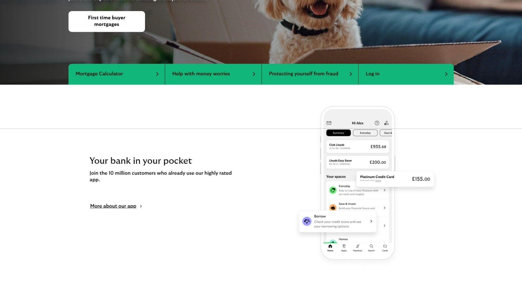
- Using your app interface in your website design does several things. It sets a realistic expectation for the user in how they will be using the product. It ensures there are no surprises during the user journey. In this case, Lloyds Bank is highlighting how the practical experience of their services will be through an mobile application. On a deeper level, it makes Lloyds Bank seem helpful to a prospective customer. They've predicted their queries and are immediately walking them through the process of using their services. It also subtly moves past the whether the user will become a customer, and starts showing them what perks they'll have access to as if they had already agreed to sign on.
- The app interface is also an opportunity to highlight some of the services that the company is keen for the user to remember. Every part of the UI design flows towards the main offer being made to the user. In Lloyds Bank's case, lending money to first-time house buters. So, the app interface is an opportunity to highlight its lending services: "Borrow" and "Platinum Credit Card".
User Experience
The UI/UX of Lloyds Bank's website is made to sell mortgages - not exclusively, but primarily. The UI creates a UX of homeliness, comfort, trustworthiness, and simplicity. The pictures of home, young people framed by markers of success (e.g., expressions of joy, attractiveness, fashionable clothing, sports), and domestic aspiration (e.g., household pets, cardboard boxes in a living room) appeal to the desire to have a home. The product being sold by the UI/UX is not mortgages, it's home.
The could-be customer scrolls through the website, and comes away with a feeling of Lloyds Bank as a helpful, approachable, dependable company that will help them build a home.
Now, the UI isn't doing all the work. Lloyd's is a well-known institution. It has staying power - it's been around long enough to plant the seed in people's minds that "they must be doing something right". The classic-ness of the logo is channeling that assumption. The comfort-inducing familiarity that the UI creates has that foundation - a serious business in the background power. And importantly, nothing about the UI undercuts that. In fact, in connects it with youthful energy, nostalgia for home, and a desire to help.
The resulting UX is of a trustworthy, optimistic service provider that invites you to let it help you build a home.
📩 If you have any questions, comments, or suggestions - please contact Guillermo Pablos Murphy on Tela:
tela.app/id/guillermo_pablos_murphy/621afa
☕️ Subscribe to the Tela Network Podcast:
youtube.com/@TelaNetworkPodcast
☕️ Follow Tela Network on LinkedIn:
linkedin.com/company/tela-network

