The Elegant Design of Linear.app
📩 If you have any questions, comments, or suggestions - please contact Nicholas Piano on Tela:
tela.app/id/nicholas_piano/7d32b1
🤝 Add Nicholas Piano on LinkedIn:
linkedin.com/in/nicholas-piano
🌎 How to join Tela Network:
tela.network/join
They say the best artists steal, but adapting the best parts of another's work to the use-case at hand still requires meticulous and careful work.
At Tela Network, we use Linear every day to manage tasks, projects, and even business relationships. It's simple and powerful, and has everything we need to keep an eagle eye on the whole project at once.
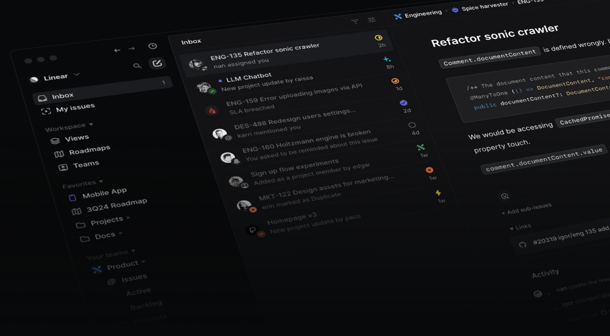
The elegance of the design has inspired many parts of Tela's user interface, and I'd like to showcase some things that make Linear a pleasure to use.
Filtering
When managing a large project, the volume of data can quickly become overwhelming. Using Linear to filter information is extremely intuitive.
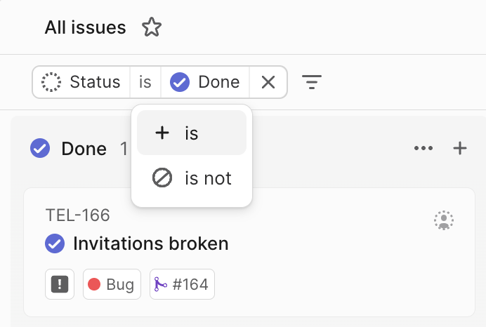
When you select a filter, a small indicator appears in the filter row, providing all the necessary information. Every aspect of it can be easily modified in place, making the process quick and effortless.
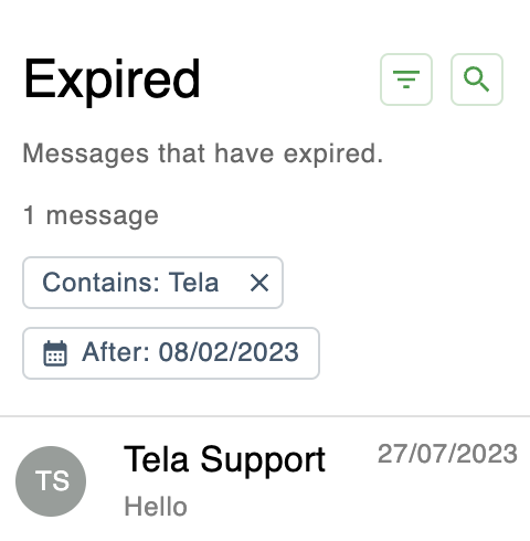
For Tela, we've emulated this simplicity by minimizing the amount of unnecessary information presented to the user.
Keyboard Shortcuts
No other application I've used has a system for integrating keyboard shortcuts as smooth as Linear's.
After pausing the cursor over almost any interface element for a couple of seconds, a friendly banner pops up to gently guide the user to an even faster way of accessing what they were looking for.
This wasn't required, but Linear did it anyway.
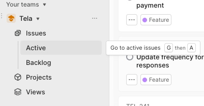
The Tela app doesn’t have this great addition yet, but it will in the future. It’s too good to pass up on.
The "New Issue" Experience and Suggestions
One of the most important things I have learned from Linear as a web designer is to be gentle. A user needs to see and understand what is being presented to them. The user experience is improved if everything feels comfortable, natural, and expected. We aren't writing a horror movie. We are in the business of respecting the user's time.
Starting a new issue might seem trivial, but a frequent task should be as comfortable as possible. Linear makes this easy with a clear layout and excellent features like 'Suggestions'.
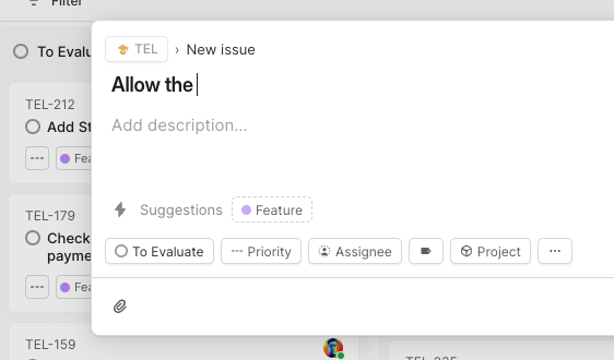
I assume it relies on keywords, but I can't rule out elder sorcery just yet. I am pleasantly presented with exactly what I need as I need it. The animations in Linear are soft and timely, and they flow like water. I feel part of the workflow.
Conclusion
I learn every day as I use applications that augment who I am as a professional and Linear is the poster child of this principle.
I learn everyday with apps that augment my professional experience. Linear is the gold standard app for this principle.
I’m grateful to have learned so much from their work.
I wish them all good things to come.
📩 If you have any questions about Tela Network - please contact Nicholas Piano:
tela.app/id/nicholas_piano/7d32b1
☕️ Follow Tela Network on LinkedIn:
linkedin.com/company/tela-network
☕️ Follow Tela Network on Twitter:
twitter.com/tela_updates
🔔 Join the Tela Social channel on Telegram to get every new update:
t.me/tela_social
📸 Follow Tela Network on Instagram:
instagram.com/tela_updates
💹 Invest in Tela:
tela.network/invest
☕️ Subscribe to the Tela Network Podcast:
youtube.com/@TelaNetworkPodcast