How Maps Deceive You
"... Most people are used to seeing a map of the world where they are central and other countries are peripheral."
📩 If you have any questions, comments, or suggestions - please contact Guillermo Pablos Murphy on Tela:
tela.app/id/guillermo_pablos_murphy/621afa
🤝 Add Guillermo Pablos Murphy on LinkedIn:
linkedin.com/in/guillermo-pablos-murphy
🌎 How to join Tela Network:
tela.network/join
A slightly modified version of this article was used as the script for the first episode of the Guillermo Pablos Murphy's 'New Discourses' series.
📺 Watch the episode on YouTube:
Have you ever thought about why we map the world the way we do? It’s worth considering how someone might be used to seeing the world on a map depending on where they are living.
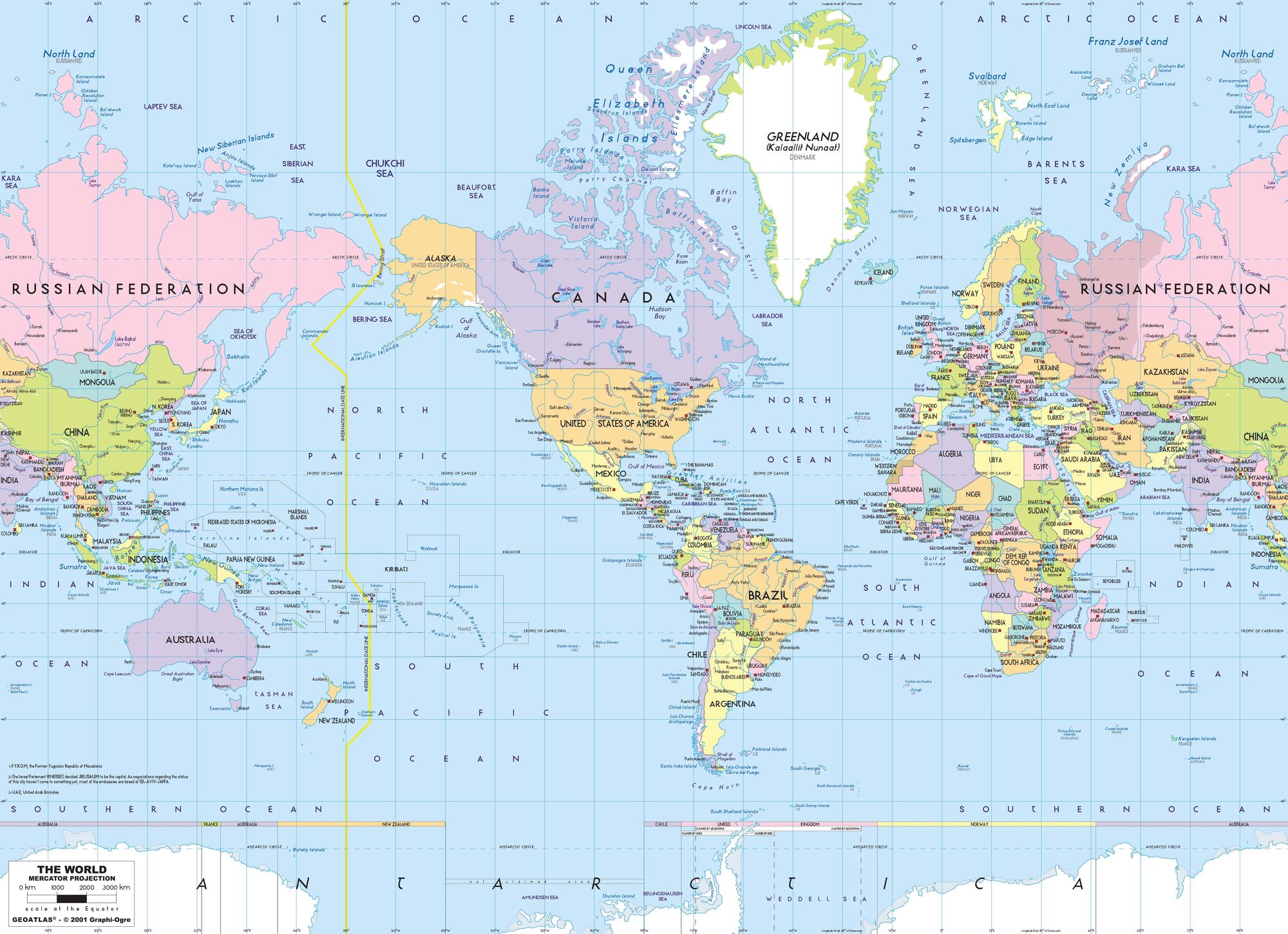
If you’re North American, you are likely used to seeing the world as in Figure 1, with the United States of America, Canada and Mexico at the center of the world stage.
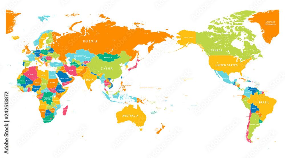
If you’re Asian, you would be more accustomed to Figure 2, with Eurasia center stage and the Americas on the right side of the map.
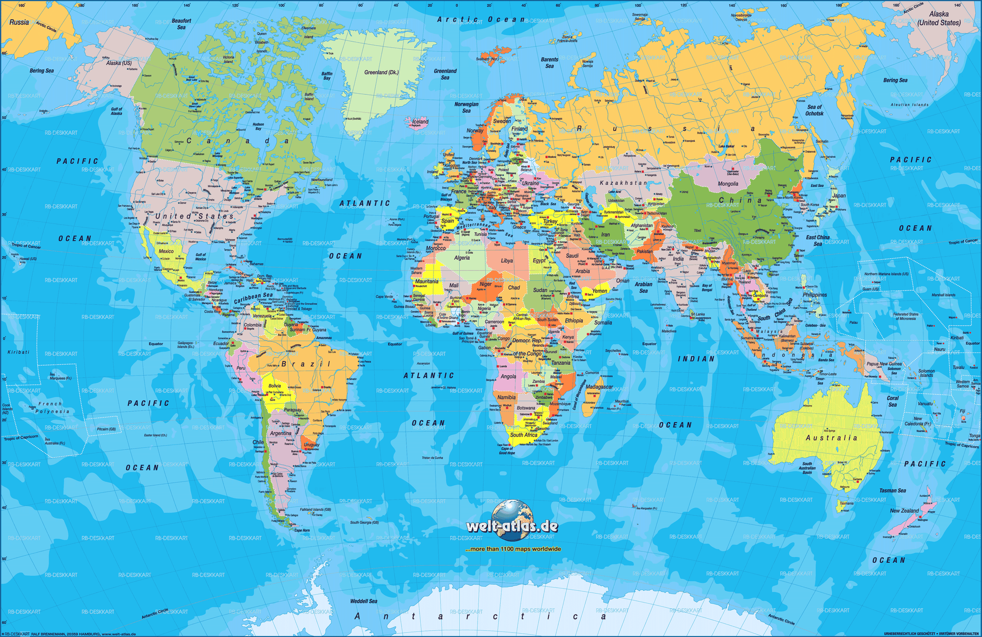
If you’re European, you are likely used to Figure 3. Europe - and Africa beneath it - marking the axis of the world, and the American continent to the left.
Imagine if one of the ones you are unaccustomed to was the main way you and your culture viewed the world. Consider how this could affect the way you see the world. More interestingly, consider how you might think differently about your country or region's role in geopolitics. Most people are used to seeing a map of the world where they are central, and other countries are peripheral. Most people think their country has a central role to play on the world stage of international relations.
As an exercise in suggestion, consider some of the terms I used and the impression they denote:
A region being the “center” of the world stage.
The Americas being on the “right side" of the map.
Africa being “beneath” Europe.
Making something central in visual composition denotes importance. We have a certain way in which we interact with visual composition. Our eyes look over two dimensional compositions and rest on the object at the center of the composition, if there is one. The center of an image is literally the focus of our attention. This is likewise with maps. We perceive whatever is at the center of a map as the most important part of it. Point being, by mapping your own country at the center of a world map, you’re symbolically placing your country at the center of the world stage, of central importance to world affairs and international relations. This sort of cartographic narcissism isn't surprising. The first thing anyone wants to do on a map is know where they are, then they can find out where others lie in relation to them. But a place's centrality on a map can lead to accidental delusions regarding its importance, simply as a consequence of how we perceive a visual composition.
Regarding the ‘right side of a map’: We talk about being on the ‘right’ side of the law, the ‘right’ side of history, more broadly about being ‘right’ and about ‘righteousness’. In English, the word ‘right’ is derived from the old Greek ‘orektus’, meaning ‘honest, and morally upright’, and the Latin ‘rectus’, literally meaning ‘straight’. It developed into modern English carrying associations to ‘conformity with truth’, ‘reason’, and ‘correct’-ness. The correlation of these positive associations with a relative direction, the right side of something as opposed to the left side, is ascribed to the early Christian church, which symbolically associated the left side of something, and especially the left hand, with the work of the devil. This isn’t unique to English. For example, in Spanish, the right hand is called ‘diestra’ and the left hand used to be called ‘siniestra’, which means ‘the sinister one’.
In cultures used to speaking of an abstract ‘right side' of something, it is worth considering if the placement of regions on the right side of a map has any consequences on the way we perceive the countries and peoples of East and West, based solely on their placement on a map.
Finally, aligning North-South with the vertical axis on every map has its perceptual implications as well. We are predisposed to perceive countries positioned above others as ‘better’, just as we perceive items placed higher than others of greater importance. You can see this everywhere. A news agency places its most important stories at the top of its publication. The tallest building in a village is the building that forms that community, often a religious structure that places an idol at high point of reference. At the Olympic games, we place a contest’s three medalists on platforms according to their outcome, with the best athlete placed on the highest stand. The winner of a fight stands above the defeated rival. We climb up ladders of achievement. You fall to rock bottom and reach up to break a glass ceiling. If something is beneath us it is lesser than us and not worth our time. Etymologically, something inferior to you literally means lower than you.
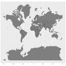
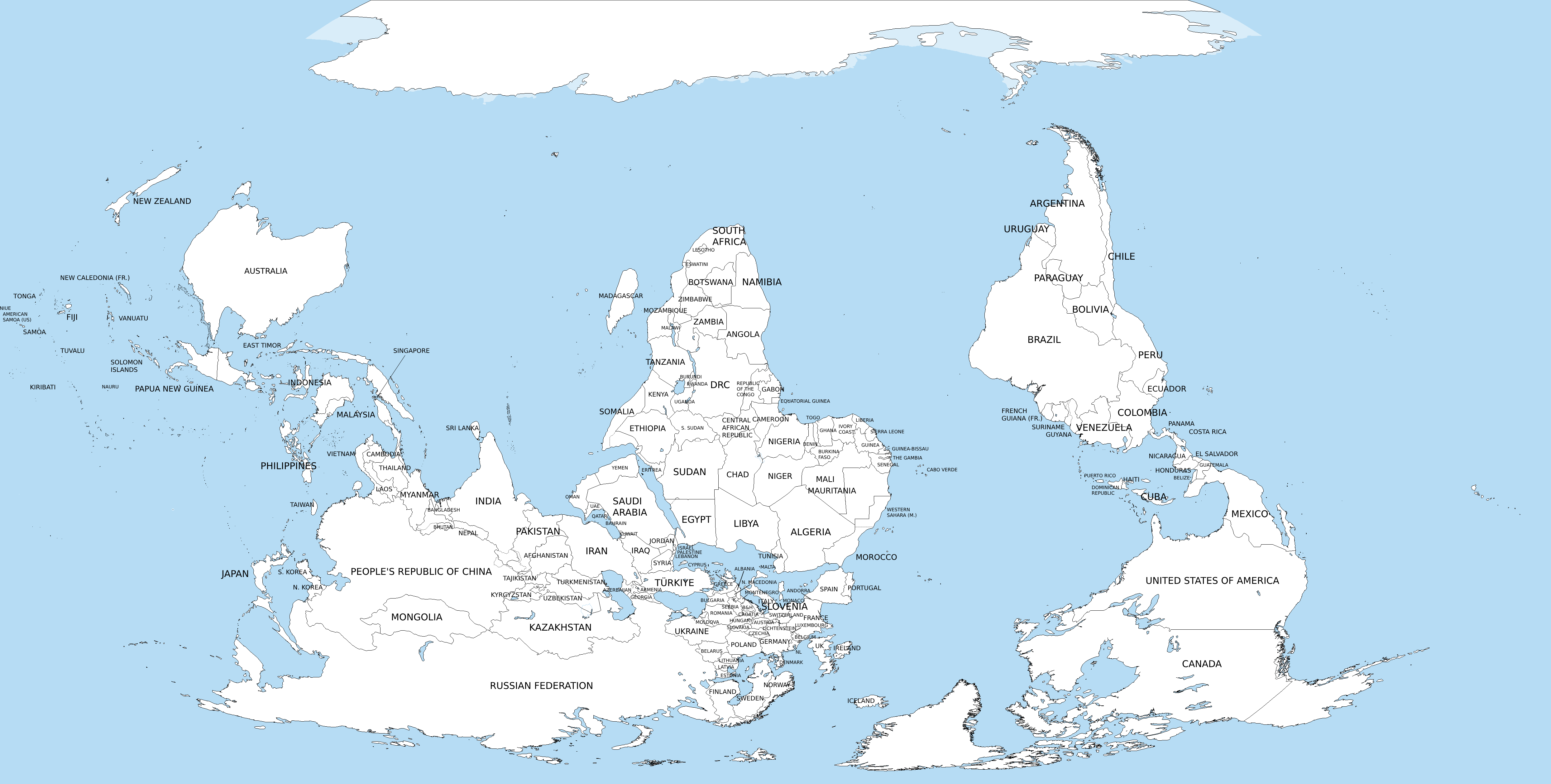
To reiterate: We are predisposed to perceive a country placed above another visually as actually ‘better’. Naturally, this is completely irrational, but understandable. Be aware of this predisposition, and correct for it. As a fun exercise, consider seeing the world inverted to a South-North orientation, as in Figure 4.

Similar to understanding higher to mean better, we are predisposed to relating bigger to stronger. We often perceive a bigger country as being stronger than a country with less territory. Now, this is a more useful predisposition than equating a higher position on a map to any difference in quality, but it remains simplistic. More importantly, maps still deceive us about the real sizes of places.
The Earth is a sphere, or more correctly an ellipsoid. Consequently, a rectangular piece of paper or a flatscreen are not accurate ways to map the Earth. Most of the time however, it is simply more convenient to use a flat map of the world. Many projections, as flattened depictions of the world are called, have been designed over the centuries, each design prioritizing a different use case; most often, navigation. All map projections distort the shapes and sizes of Earth’s surface. The one you are most likely accustomed to seeing is the Mercator Projection. It is used by the predominant navigation apps - your Google and Apple Maps - and is within most textbooks and maps you encounter in education. You can visualize the Mercator projection as unfolding the surface of a globe outward onto a cylinder, and flattening the cylinder onto a sheet.
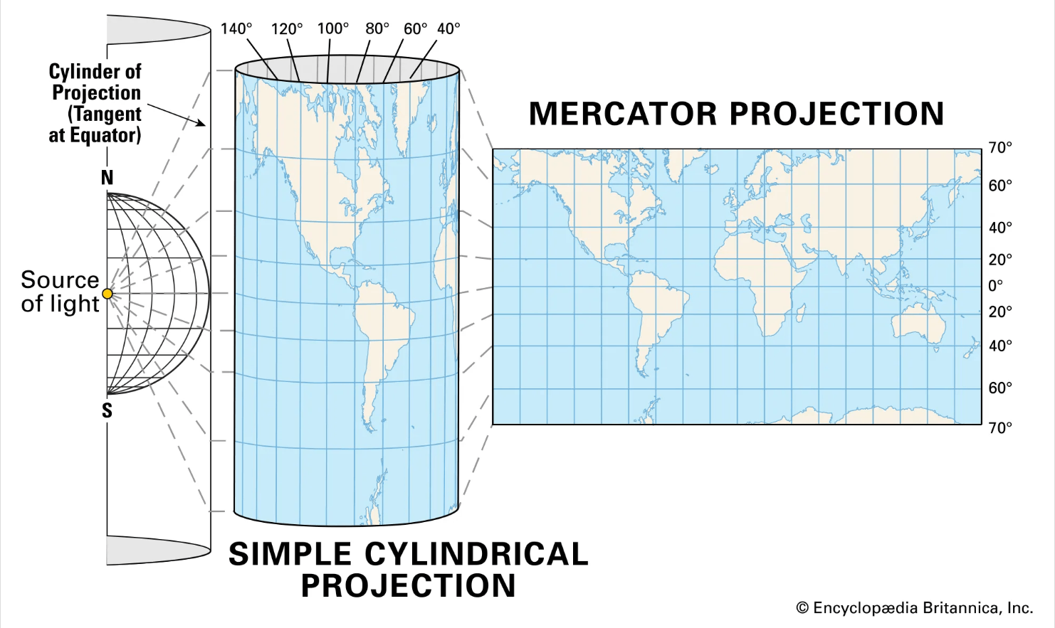
This results in a map with areas of exaggerated sizes far from the equator; the closer to the poles of the Earth, the greater the distortion. Other projections exist, each with their own choice priorities and distortions. On the Mercator Projection, Greenland looks to be the same size as Africa, when in fact Africa is 14 times larger. Alaska appears to be the same size as Australia, although Australia is actually 4.5 times larger. The islands of Madagascar and Great Britain look about the same size, while Madagascar is actually more than twice as large. A fun way to discover the way the Mercator projection distorts sizes is the website thetruesize.com, which allows you to drag a country’s outline across the Mercator projection and have it adjust its size to the distortion in real time. Be aware that the maps that you use everyday carry deceptive depictions of the world.
To summarize, maps are deceptive depictions of the surface of the Earth. What countries are visually central, peripheral, or on the upper half of a map, will generate irrational impressions of reality relating to those areas. Furthermore, the maps you use daily are not accurate depictions of the size of countries. This can cause us to incorrectly appraise the reality of certain countries. Be aware of these inaccuracies and act on your perceptions accordingly.
📩 If you have any questions about Tela Network - please contact StJohn Piano:
tela.app/id/stjohn_piano/7c51a6
☕️ Subscribe to the Tela Network Podcast:
youtube.com/@TelaNetworkPodcast
☕️ Follow Tela Network on LinkedIn:
linkedin.com/company/tela-network
☕️ Follow Tela Network on Twitter:
twitter.com/tela_updates
🔔 Join the Tela Social channel on Telegram to get every new update:
t.me/tela_social
📸 Follow Tela Network on Instagram:
instagram.com/tela_updates
💹 Invest in Tela:
tela.network/invest